The Smart Cash Register
Enhancing REWE Pick&Go with Checkout Feedback
Pick&Go introduces a checkout-free shopping experience where customers walk in, pick up what they need, scan a QR code on their phone, and leave. The system automatically tracks purchases, eliminating the need for scanning or waiting in line, while later allowing users to verify whether all items were correctly registered. Despite these advantages, some users hesitate to adopt Pick&Go due to the lack of immediate feedback – many want reassurance that their items are properly recorded. Additionally, the core experience of using Pick&Go with a mobile phone is a significant shift from traditional shopping methods, making it less approachable for some customers. To address this, we enhanced the smart cash register: a hybrid system that combines Pick&Go’s automation with a familiar self-checkout experience. The smart register retains Pick&Go’s core technology – tracking movements in-store and recording items taken from shelves – while integrating a verification step at the till. Users can confirm their selections on-screen before paying, providing reassurance without requiring a dedicated mobile application.
What?
Prototyping
Usability Testing
Animation
Illustration
UI Design
With whom?
Sebastian Wientzek (Sr. UX Designer @ REWE digital)
Niclas Dietrich (Sr. UI Designer @ REWE digital)
Issues with existing solutions
During the initial rollout, we stuck close to the usual self-checkout designs to maintain familiarity. However, we observed a recurring usability issue – customers frequently mistook on-screen product lists for someone else’s. This confusion needed to be addressed while preserving REWE and Pick&Go branding.
The design adjustments laid out here aimed to establish the smart cash register as a distinct yet familiar experience. Particularly, we wanted shoppers to understand that the products that they see listed on the screen are actually theirs. Additionally, in-store communication further communicated the process and its advantages.
Simplifying a Complex Process
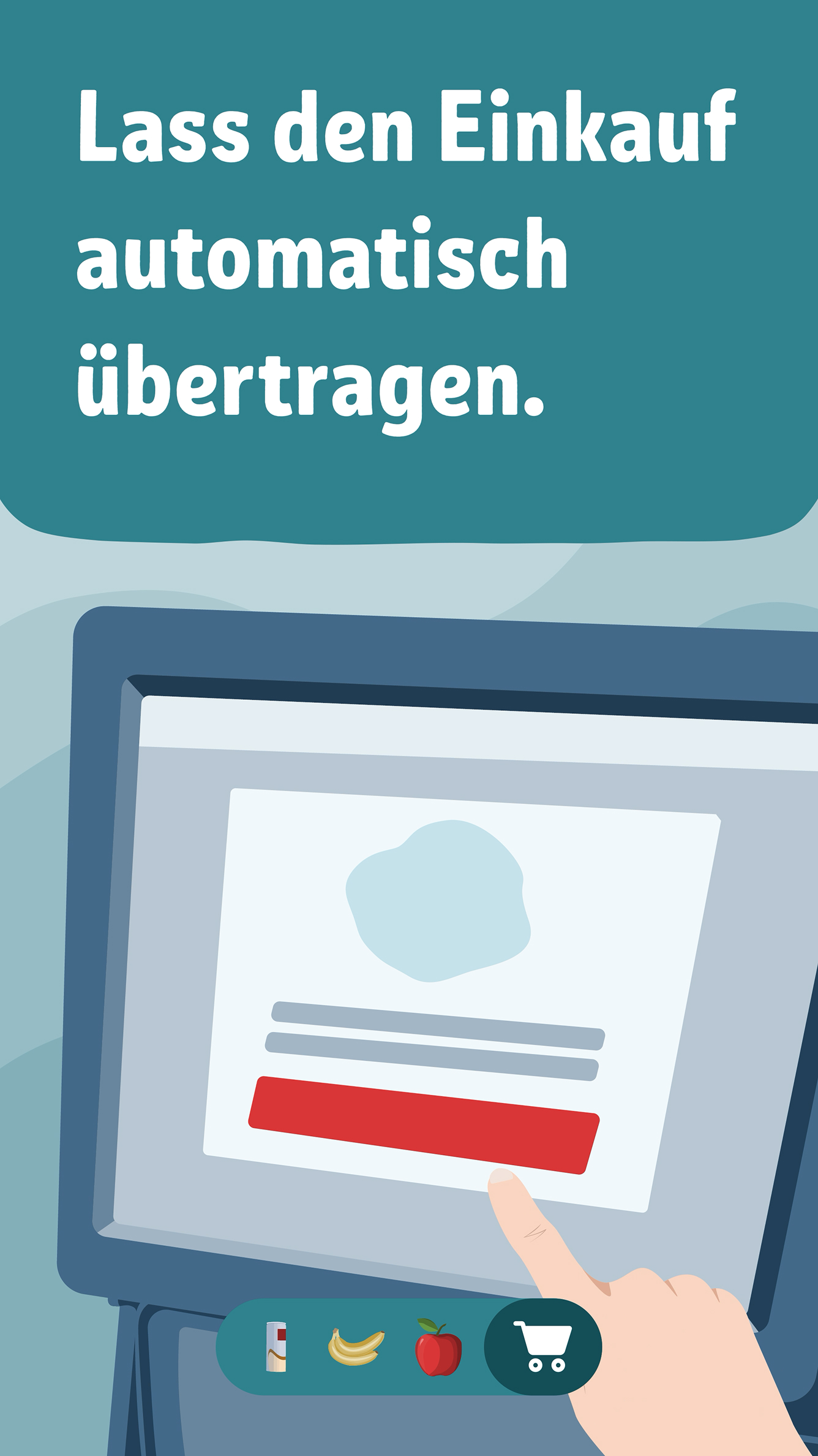
In-store displays played a crucial role in introducing the smart cash register. A mix of animations and static visuals helped convey the system’s functionality. The challenge was to distill a technically intricate process into a simple, intuitive message that could be understood in under 30 seconds.
We developed a storyboard and refined messaging iteratively to strike the right balance between clarity and persuasiveness. The final visuals were then integrated into the store environment, including animations displayed in the shop windows.
Improving Clarity and Confidence
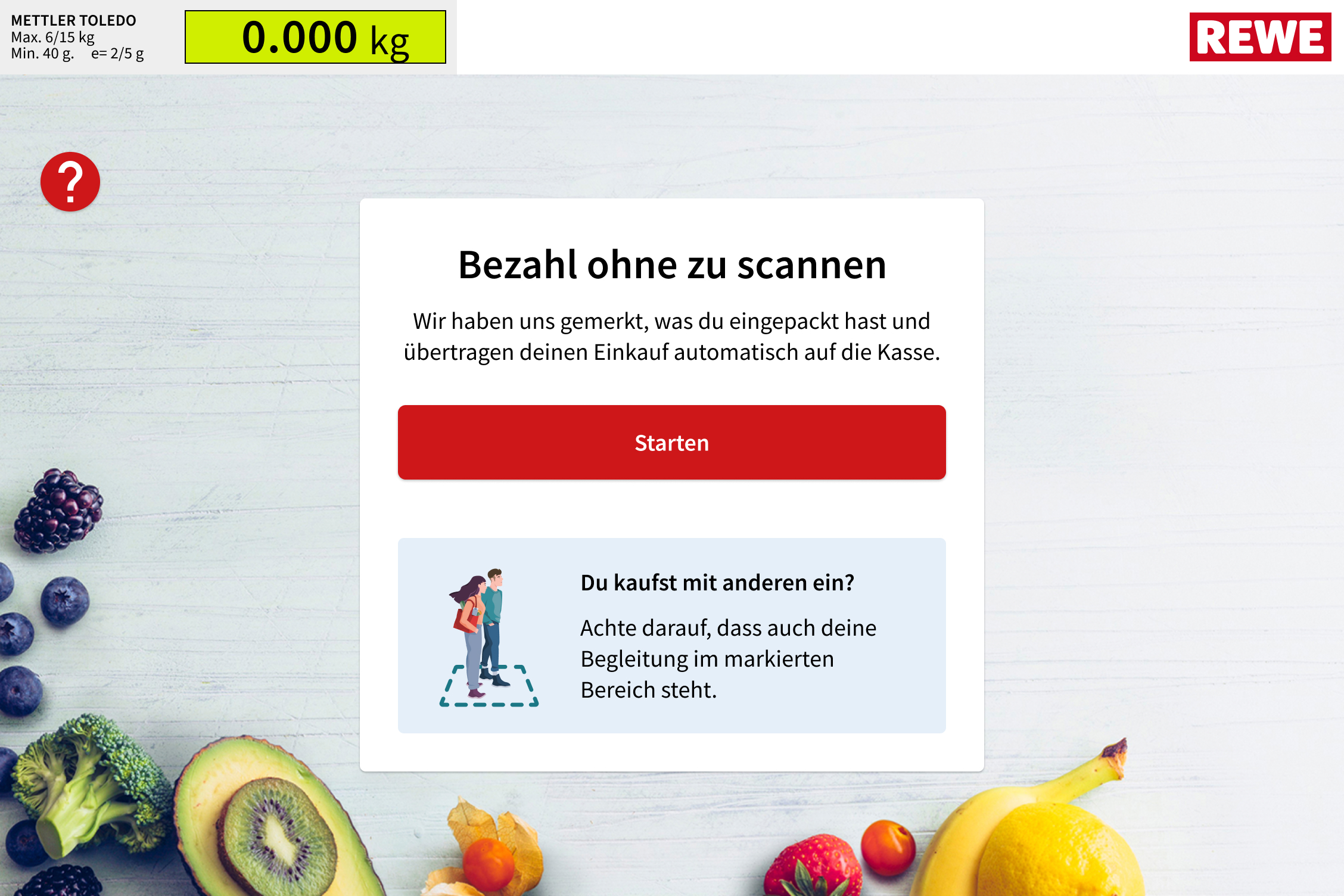
A crucial component of our redesign was refining the till screen to prevent misinterpretation of displayed items. While the core checkout flow remained intact, several design adjustments were made to ensure clarity. By incorporating scenes from the POS animation into the loading screen, we aimed to create a strong recognition factor, ensuring that users instantly understood that the system was actively registering their purchases. Improved wording further supported this goal, with labels and instructions revised to explicitly emphasize that items had already been recorded, eliminating any ambiguity about whether additional scanning was needed. To make the system more accessible, English translations were added alongside the default German labels to accommodate international customers.
Finally, we adjusted the UI design in an iterative approach, aiming for a more modern, concise and on-brand look.
User Testing and Iteration
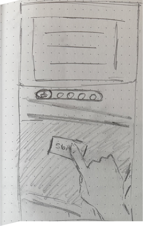
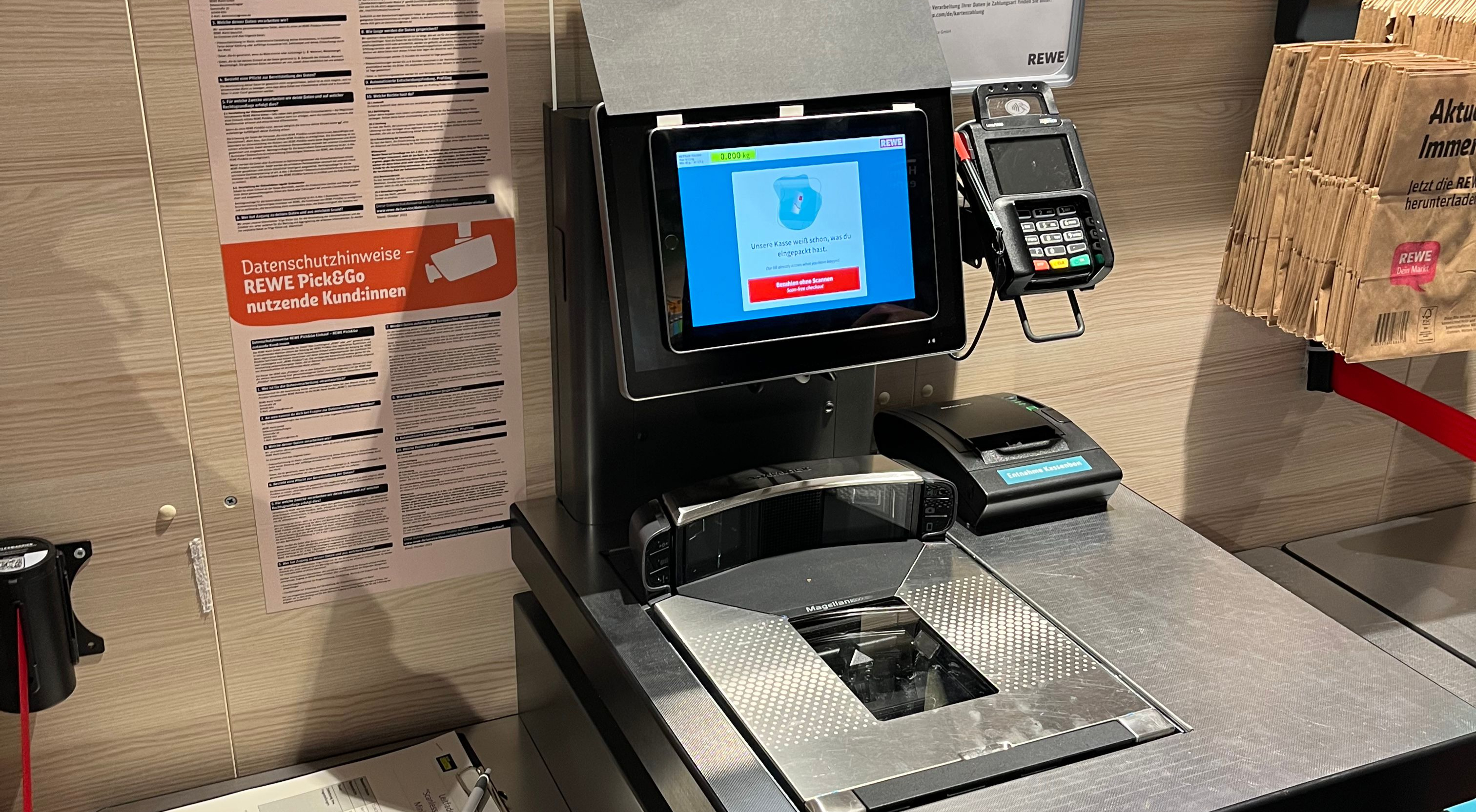
To validate the redesign, we conducted live testing in a supermarket. In true rapid prototyping fashion, an iPad displaying the updated interface was affixed to a till screen. Test subjects were instructed to collect items, proceed to checkout, and provide feedback of what they had seen.
Users demonstrated a strong understanding of the interface and process. The majority of participants quickly grasped that the system had already registered their items without requiring manual scanning, which was a key objective of the redesign. No significant usability issues were identified. However, some minor refinements were derived from the tests. For example, a few users hesitated before pressing the start button, leading us to add an icon that clarified its purpose. Even the loading animation was ultimately refined in detail.
Closing Thoughts
The smart cash register underlines the importance of holistic UX design – every touchpoint in the customer journey influences adoption and satisfaction. While system architecture and user flows form the foundation, details like wording, color, and animation play a crucial role in making a technology both accessible and appealing. By refining these elements, we bridged the gap between cutting-edge automation and user confidence.