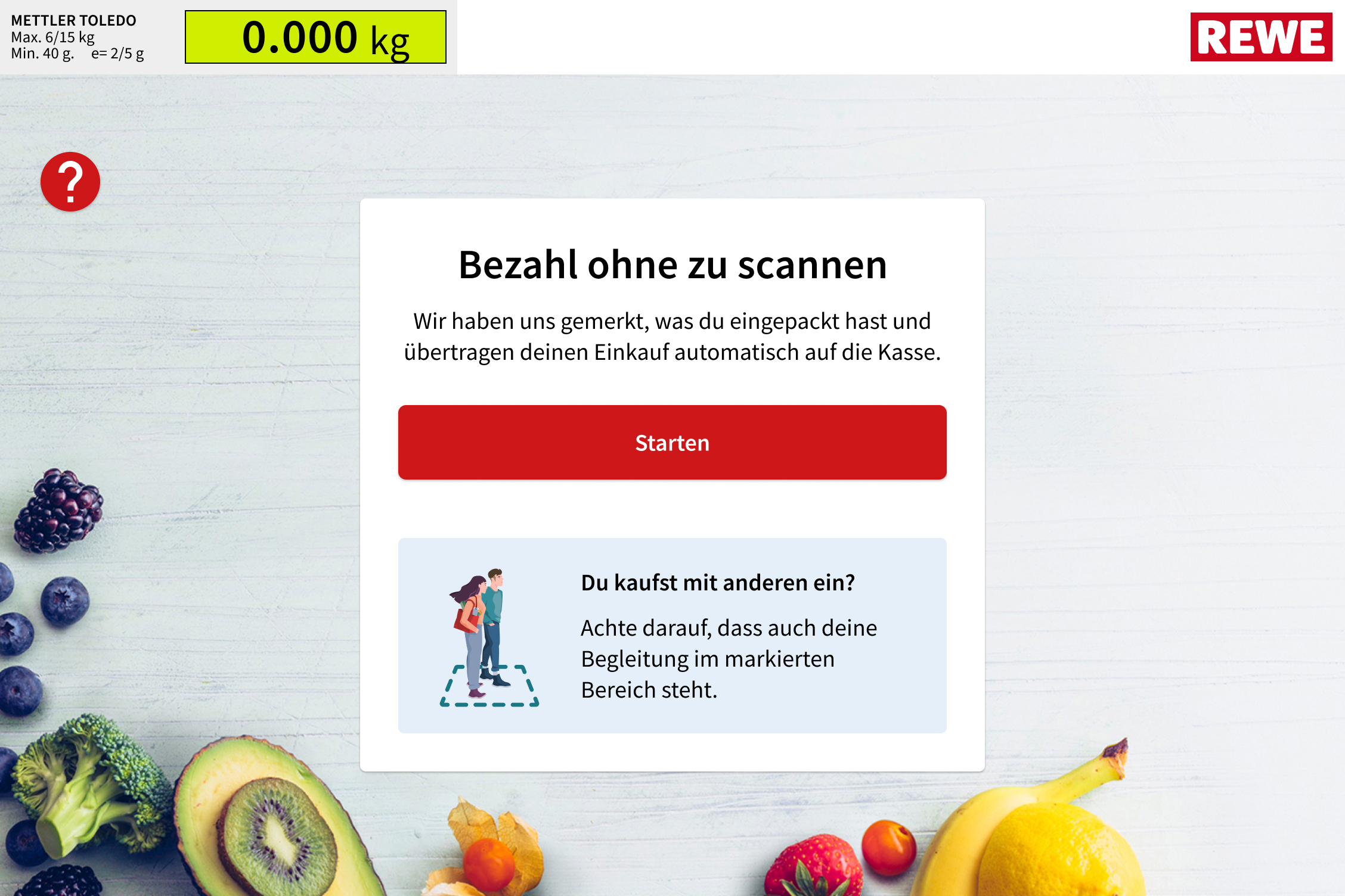
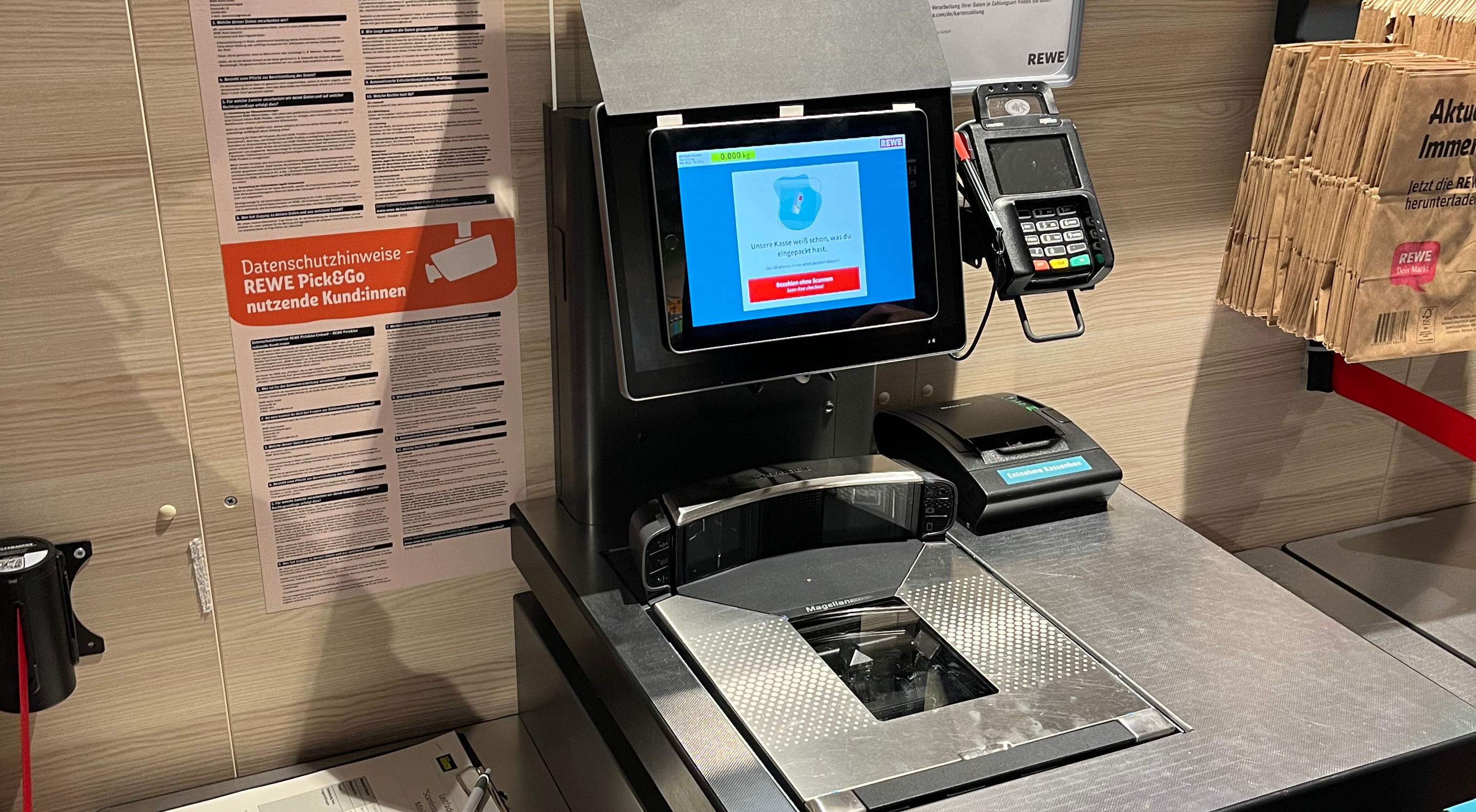
During the initial rollout, we stuck close to the usual self-checkout designs to maintain familiarity. However, we observed a recurring usability issue – customers frequently mistook on-screen product lists for someone else’s. This confusion needed to be addressed while preserving REWE and Pick&Go branding.
The design adjustments laid out here aimed to establish the smart cash register as a distinct yet familiar experience. Particularly, we wanted shoppers to understand that the products that they see listed on the screen are actually theirs. Additionally, in-store communication further communicated the process and its advantages.